Parsons
I recently finished my MFA in Parsons Design and Technology program. It's like a giant toybox. Love it.
Bootcamp
In the summer of 2006, I got a sneak peek at the MFADT program by taking this month-long crash course. Made a lot of crazy stuff, met a ton of great people, and never slept a wink. Good times.
- Design
- Web
- Code
Bootcamp Final: Fatto! Fatto!
For my final project in Parsons D&T bootcamp, I created a site called fattofatto.org that was designed to promote the sport of bocce in New York City. I have a real love for the game, so this was a fun project, especially making mini-documentaries by interviewing other players and building a game based bocce's basic skills. Fatto!
Fall 2006
This is the work that I did in the Parsons Communication Design and Technology Masters program during the autumn of 2006.
Creativity and Computation
Theory with Sven. Really fun, wide range of assignments, and we get to make podcasts and other weird stuff! Check out some of my work so far:
Bring on the noise?
The proprietors present this fine entertainment, being the podcast in which one Mr. Edwards expounds on noise, aural and digital, and how said noise ties together the coin toss, the credit card, and Guantanamo Bay. Humbly presented for your distinguished listening and with due thanks to the members of the freesound project who contributed samples of their efforts for the creation of this auditory presentation under the esteemed Creative Commons Sampling Plus license:
- jmaimarc (coindrop1.wav)
- Jace (Coin_dropping.wav Coin_dropping_long.wav)
- agarwal.parag (coin2.wav)
- Anton (scanner_NR.wav)
- virotic (machine7.aif)
- NoiseCollector (granugrinder.wav dime.wav)
- dobroide (obras.mp3)
- digifishmusic (Transaction_3_in_Department_Store_Australia.mp3)
| Attachment | Size |
|---|---|
| podcast1.ogg | 1.4 MB |
The Incredibly Boring, Dreadful Technology That Just Might Save Millions of Lives
The proprietors extend a further invitation to the world of technology as surveyed by one its most humble practitioners as he confounds the assembled with tales of a truly dreary technology that nevertheless possesses the potential to improve the standard of living among this planet's poorest citizens. The producers are indebted once again to the members of the freesound project who contributed samples of their efforts for the creation of this auditory presentation under the esteemed Creative Commons Sampling Plus license:
- virotic (machine1.aif)
| Attachment | Size |
|---|---|
| podcast2.ogg | 1.73 MB |
Major Studio: Interface
In this class, we studied how people interact with the world around them. And we designed all manner of crazy things.
Boxes (Round 1)
Our first assignment was to build three boxes with different materials or other properties. I made these three in stackable sizes and varying opacities.

| Attachment | Size |
|---|---|
| dcam0863.jpg | 93.05 KB |
Boxes (Round 2)
Then we had to make fifty boxes! I used a survey and a genetic algorithm over the course of four generations to determine which boxes came out on top.
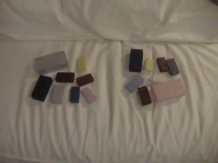
More Boxes (Early Generation)
Here's an earlier generation of the boxes project for interface class. Most of these were "killed" later by the genetic algorithm I used to generate more boxes.
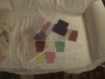
More Boxes (Later Generation)
This is a later generation of boxes. The losers are on the right. My genetic algorithm evaluated each box based on preferences I got from people in surveys. The genome of each box contained its color, size, opacity, and saturation. Clearly, the transparent ones were not the fittest. The red ones were quite successful, though.
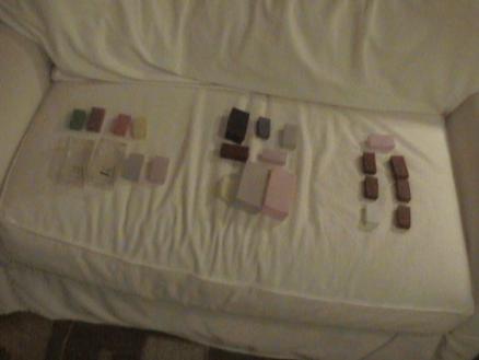
More Boxes (The Dustbin of History)
Once I was finished with the boxes, the ones that never made the cut were crushed. Think of my foot as the Permian-Triassic extinction event.

The Algorithm
This is the python script I used to determine the winners and losers among my box designs. Each box had a genome that encoded its color, saturation, size, and opacity. Boxes with more votes were allowed to mate. The rest were crushed. Circle of life.
| Attachment | Size |
|---|---|
| box_gene.py.txt | 2.12 KB |
LargoCargo - Stuff for a Slow World
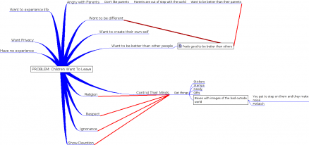
LargoCargo was a project that incorporated yet another box form to serve as a product for one of the worlds described in Einstein's Dreams. Ours were surprise boxes that children could collect and then smash in a "yearly" festival. The idea would be to disseminate propaganda among the young so they would never leave their parents in a world where time ran much, much slower than the rest of the world. Wacky stuff.
Above is our "Why/How" diagram that analyzed the situation in this fictional world and which led to our LargoCargo product.
LargoCargo Box - Anger
This is a box cover Alan designed. The idea was to create images for kids showing what awaits them in the outside world if they should ever leave their parents. In the "slow" time-dilated world in which they lived, parents never wanted to let their kids go. Read Einstein's Dream, and that will make more sense--we had to design these for a world depicted in that book.

LargoCargo Presentation
The LargoCargo project was our midterm for Major Studio: Interface. Here is our presentation.
Map of My Commute
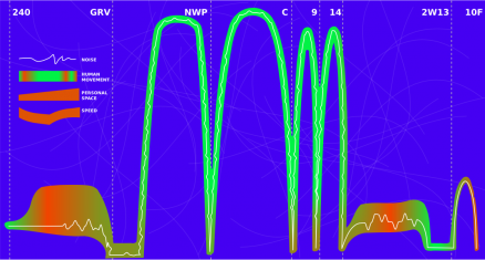
This is a map of my commute. It measures noise, human movement, personal space, speed, and location in the course of my trip from home to Parsons.

Commute Map
Observation
There are my condensed observations of the PATH station near where I live. Beware of the hard-ass Port Authority Police Department -- they do NOT like you taking photos of the station. It does help to say you're from the neighborhood, though.
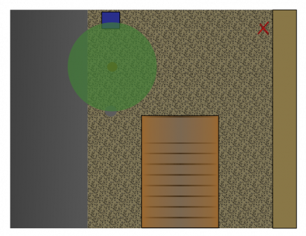
Observation - Mail Drop
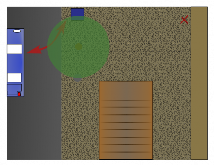
Observation - NJ Transit Bus Out
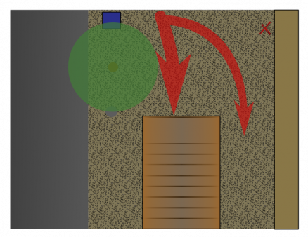
Observation - PATH In
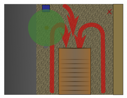
Observation - PATH Out
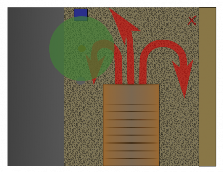
Observation - Pedestrians
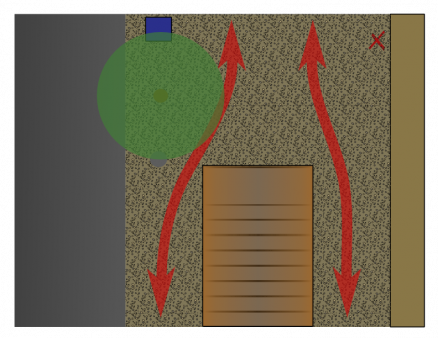
Observation - Taxi Stand
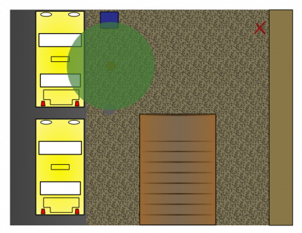
Elevator Dictionary
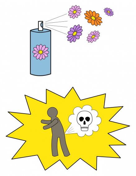
Hsinping Dai and I made a non-verbal dictionary for communicating about a subject in an elevator. That subject? What to do when somebody farts.
Elevator Dictionary 2
Elevator Dictionary 2

Elevator Dictionary 3
Elevator Dictionary 3

Elevator Dictionary
Hsinping and I made a visual dictionary for people on an elevator together to communicate with each other, dealing with a very delicate subject. See if you can guess what it is!
| Attachment | Size |
|---|---|
| dictionary03.png | 102.91 KB |
| dictionary02.png | 101.54 KB |
| dictionary01.png | 212.17 KB |
Renga Game Board
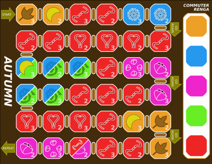
I've long been an admirer of the Japanese renga, a collaborative poetic form. One of the major drawbacks, however, is trying to remember the rules. Each person participating must write a two- or three-line stanza using a pre-determined subject, usually a season of the year. In an autumn renga, shown here, the first writer begins with a three-line verse about autumn. The next writer completes a two-line verse about the moon, which is usually related to autumn.
The game board above really nicely condenses these rules. Even though this was just a simple assignment, it solved a long-standing problem for me. I'll most likely continue working on this project in the future. If you're curious about the form or this version of it, download the attached SVG below and print it out on nice paper. Included is a layer that holds the colored squares you can use to write the renga verses. I strongly recommend you use a size of paper bigger than 8.5 x 11, and I suggest you open it with the outstanding SVG editor, Inkscape.
Journal Square Deli
For our final project, my group was required to select a location, identify two groups there, and get them to interact in anyway we chose. We picked the deli inside the Journal Square PATH station. It turned out to be an amazingly difficult but rewarding project.
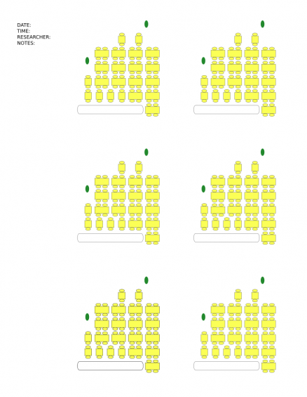
Depicted above is one of our observation sheets. Every 10 minutes, during the course of over 20 hours observing, we noted which patrons sat where, their gender, their approximate age, and their activity at the table. In so doing, we collected a truly huge amount of data that allowed us to make predictions about who would sit where for the longest period and which demographic they would most likely represent.
Journal Square Deli - Bingo
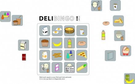
Our first attempt to intervene in the Deli. Bingo! Like travel bingo, but with deli stuff.
Journal Square Deli - Data
Attached is the raw data from our deli observations. Over 600 entries. Never let it be said we aren't thorough.
| Attachment | Size |
|---|---|
| delistats.xls | 193.5 KB |
Journal Square Deli - Deli Oracle Volcanos
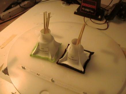
"Lot pots." Left on tables in the deli to get people involved in their tables and with each other. Each pot has a set of fortunes that require you to interact with other tables. Weird looking, but fun.
Journal Square Deli - The Restaurant Telegraph
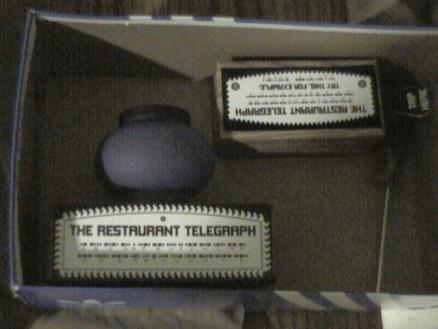
The ultimate in deli interventions--the Restaurant Telegraph! Each half is place on a separate table. The switch lights up the lamp and sets off a sound. Cool, though much more fun in bars than in the Journal Square Deli, as it turned out.
Attached is the SVG file for the labels, in case anyone wants to repeat the experiment.
Journal Square Deli - Presentations
These are our presentations for the Journal Square deli project. They're huge downloads, but well worth it if you're fascinated by Jersey-City commuter dining. And, be honest, you know you are.
In all seriousness, this was a very challenging project and well worth the considerable effort. We learned a lot and built interesting things. What more could you ask for?
Physical Computing
In this class, I learned a hell of a lot about electronics and physical computing. Now I can't stop busting things open to see what I can pull out of them. Keep a close eye on your peripherals when I'm around.
Some work:
Audio Graffiti
For my midterm project, I hacked the sink in our 10th-floor bathroom.
The sink had an IR sensor with an exposed control box. I cracked that open, split off the power and sensor-data lines, and got it trigger a light show under the sink and play a sound sample from a speaker I attached under the porcelain. I left a record button hooked up to it, and, pretty soon, people were recording their own strange sounds and messages that would play every time someone went to wash their hands.
| Attachment | Size |
|---|---|
| audiograffiti.ogg | 1.25 MB |
Enter The Dragon
For our physical computing final, each pair of students had to complete a link in a chain reaction, receiving an input from the previous team and producing an output for the next team.
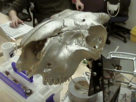
Here's our AC/DC-playing, silver-painted-goat-skull, black-polycarbonate dragon. Our only design consideration: Make It Metal!
| Attachment | Size |
|---|---|
| dragon.ogg | 1.48 MB |
Metal-Head Goat Skull
This is the goat skull that was part of the physical computing final project. Inside its sinuses is a halogen bulb hooked up to a relay. He really lit up the room!
Sound and Vision with Max/MSP
Max/MSP (and it's open-source cousin PureData) are great ways to get multimedia applications up and running in no time. Plus, it's just a really fun class.
- Gravity Ball
- Gamepad Video Controller
- Automated Blues Band
- Midterm: Cryptogram
Spring 2007
The following are the classes and other work I contributed to during the spring semester of 2007.
Casual Games
In this class, we'll be putting together a game from the brainstorming phase right up into a good prototype.
Game Project
This is the game project I'm working on for the Casual Games class. It is tentatively entitled Phevo.
Interaction Spec
PHEVO
My project for this semester will be a game that is similar to battleship, but involves biological infection instead of artillery.
In Phevo, you have a board full of creatures, called phevos, that have a simple "genome." This genome expresses itself in the phevo's appearance. For example, phevos may have "genes" that code for the appearance of a red outer shape, and yellow inner shape, and several different geometric possibilities in their appearance.
The board you have is set up next to a board representing you opponents. There will be any where between 16 and 64 square on the board (the exact number will require user testing.)
 Early Test Of Phevo Board: This is a sketch I made of what the board might look like in Phevo. Some of the elements important to the game are already present.
To begin play, the user selects a phevo to attack the enemy. A regular phevo will be able to attack an enemy phevo with the same genotype. However, by spend more time (or resources, perhaps,) that phevo becomes more generalized. It may lose color or shape. This indicates that the phevo will be able to attack a broader range of targets. For example, a phevo without color may be able to attack phevos with the same shape in any color available. This makes the attack stronger.
Once the attack phevo has reached sufficient strength, the play can release it to attack the enemy. The player will need to balance between launching many quick attacks (very specific, depletes board stock) and slower power attacks (takes considerably more time.) The pace of this will have to be gamed in a prototype.
"Promoting" a phevo to attack leaves an empty space in the board that the player will need to fill. This can either be done by mating phevos or by cloning (I may have cloning be the default behavior, and may let that happen automatically unless the player intervenes otherwise.)
The game ends when the opposing player has had all of his or her phevos destoyed.
Attached is an archive based on a mechanic I have been meddling with for some time now. Requires Python and Pygame.
| Attachment | Size |
|---|---|
| phevo.zip | 198.26 KB |
Alpha Release Document
Today we see the release of phevo-0.0.33, the first alpha release of the game. It features a very basic AI opponent, more extended gameplay over previous versions, a brief set of instructions, and a number of bug fixes.
Phevo has also been set up for distribution at SourceForge.net, the largest open-source development site on the Web. It is through SourceForge that development of Phevo is likely to continue into the future.
Because of the difficulty in developing and testing a game on my own, I have decided to open-source Phevo under the GNU Public License and release it to the public for testing and development. It is my feeling that Phevo will be able to find an audience, attract developers, and improve in quality because of this.
I would like to address these future developments point by point. First off, the audience for open source games is small but growing. There are a number of sites online, such as the Linux Game Tome, the specialize in Linux and OSS games for the community. It has been my experience that open-source users are very willing to try out new games, test them, report on them, give feedback, and even begin to crack them open to see how they work.
This presents me with a two-fold benefit. I develop a following for the game without having to commit financial resources or deal with a publisher. This following becomes my group of alpha testers as development continues. The second benefit is that I begin to attract other developers to the project.
If the proprietary world of software competes for financial resources, the open-source world competes for developer interest and time. I think I can garner enough curiosity about my project to be able to pull in at least one more person, and possibly a range of others who may commit small improvements with graphics, sound, and the like.
In addition to visual improvements, there are a number of game-level tasks that I'd like to see fulfilled in the alpha stage. One, I'd like to be able to get networking up and running so that two people could play the game against each other over the Internet. It would be especially great to get a meta-server running for it. Second, I'd like for there to be a massive code clean up in the graphics engine, which is starting to show serious weaknesses, especially with animation. Fixing this engine would allow for many more possibilities in display and UI innovations. Third, I would love to see subtle improvements in the game play as alpha feedback starts tickling in. The more feedback I get, the more I'd like to incorporate those experiences into better and more intuitive gameplay.
This concludes the pre-alpha development cycle for Phevo. I'd like to thank Peter Lee and the Casual Games class at Parsons for their continued interest, support, and criticism, which has made this odd little genetics simulation into something approaching a playable game. Cheers!
Prototype 1
Attached here is the prototype document for the first prototype of "Phevo."
| Attachment | Size |
|---|---|
| prototype_spec.pdf | 149.21 KB |
Builds
See the files below for significant builds.
- phevo-0.0.6
- First interaction test
- phevo-0.0.12
- Second interaction test
- phevo-0.0.13
- First prototype
- phevo-0.0.22
- Pre-Second prototype
- phevo-0.0.27
- Second prototype, with Windows executable in the "dist" directory
- phevo-0.0.31
- Third prototype
- phevo-0.0.33
- Alpha release
| Attachment | Size |
|---|---|
| phevo-0.0.6.tar.gz | 94.58 KB |
| phevo-0.0.12.tar.gz | 578.07 KB |
| phevo-0.0.13.tar.gz | 573.72 KB |
| phevo-0.0.22.tar.gz | 581.52 KB |
| phevo-0.0.27_win.zip | 4.63 MB |
| phevo-0.0.31.tar.gz | 860 KB |
| phevo-0.0.33.tar.gz | 715.27 KB |
Class Notes
- Notes
- Watch out for general scope
- Show the opposing side?
- Watch out for "heat death" scenario
- Don't introduce randomness -- just kills the core mechanic
- Keep an eye on the design
- Pick a system and use that
- Minesweeper?
- Battleship?
- Multi or single?
- Assignments
- Send email with presentation
- No bigger than 500k
- In email at least
- Set up a development site
- Blog?
- Sourceforge?
- Bring first playable something next week
Design and Education
This is my work from the Design and Education course during the spring of 2007.
Design Challenges
These are the design challenges I came up with for the Design and Education course. Interesting stuff.
Design Challenge #1: Playful Literacy
Challenge
How do you make learning a language/literacy skill playful?
Problem
- Topic
- Teaching designers fundamental multimedia programming skills
- Audience
- Professional designers and design students, as well as educators and psychologists who are creating applications and interfaces.
- Setting
- Higher-education institutions/design schools, professional associations, workplaces/on-the-job training.
- Problem
- How do we create an approachable learning context for groups of designers with varying experience levels in computer programming so that students will achieve a sufficient enough level of self-efficacy that they will feel able to pursue code-related projects in their own multimedia/interactive work?
Resources
- Hill, T., Smith, N. D., & Mann, M. F. (1986). Role of Efficacy Expectations in Predicting the Decision to Use Advanced Technologies: The Case of Computers. Journal of Applied Psychology, 72, 307-313.
- Czajs, S., Charness, N., Fisk, A. D., Hertzog, C., Nair, S. N., Rogers, W. A., & Sharit, J. (2006). Factors Predicting the Use of Technology: Findings from the Center for Research and Education on Aging and Technology Enhancement (CREATE). Psychology and Aging, 21, 333-352.
- Udama, L., Morrison, G. R. (2007). How do instructional designers use automated instructional design tool? Computers in Human Behavior, 23, 536-553.
- Downey, A., Elkner, J. & Meyers, C. (n.d.). How to Think Like a Computer Scientist: Python Version. Retrieved February 11, 2007 from http://www.greenteapress.com/thinkpython/html/
- Massachusetts Institute of Technology. June 18, 2002. Introduction to Logo Blocks.Retrieved February 26, 2007 from http://llk.media.mit.edu/projects/cricket...
- The Gunakara Sun Systems. (n.d.). Prograph 1.1. Retrieved February 26, 2007 from http://www.mactech.com/articles/mactech/....
Concept
 What are people going to learn? And why? What form will it take?
I intend to teach the fundamentals of multimedia programming to interface designers who have not had much exposure to programming. I will use a graphical programming language that guides players to build simple programs from a limited set of programming blocks. By doing this, players will gain an increased proficiency with programming skills and an increased sense of self-efficacy when approaching problems that require coding. It is hoped that this will enable the users to feel that they can pursue more difficult tasks on their own.
The game I will build is called Alien Pet Shop. The player is the chief mechanic of a funky store that sells unusual, customized pets to discerning customers. The mechanic's job is to build and expand the store's ordering system to allow for different kinds of requests. In the process of working on the store's machine, players will be introduced to important programming concepts suchs as variables, control structures, and functions.
Using the store as a metaphor for an interactive process, users will read the kind of inputs given to them by users. At first, the input will be very simple. Customers will ask for a specific type of pet, such as the "rudbud." The player will then set up a "plan" that will allow for a "type" request to come into the system.
After the request is in the system, the real work begins. The player will add a new "action" to the plan. The action will take the input and perform work to try and get the proper outcome.
The player can edit their actions to work with the kinds of requests that come through. For example, if the customer has asked for a "rudbud," then their action will simply be a condition that asks if the type equals "rudbud" and then returns that pet to the output.
As the player completes the simple challenges, different kinds of orders will start to come in. A customer might ask for a "red" pet. The player will then work with that input and return a set of new choices to the customer, based on which pets are red.
A further advancement will be customizable pets. A customer might ask for a "rudbud" with 5 legs instead of 3, which would require the player to set up a loop that can add legs to the pet based on the type and quantity requested.
By setting up increasingly challenging processes to manage the store, the player, as mechanic, will have to write more and more accommodating "code" to make the system work.
As they progress in complexity, they will see their work on the graphical code editor represented as an actual programming language in the code window. By showing the player multiple syntaxs, they will get used to the idea that the work they are doing in the graphical editor relates directly to the code produced in the code window.
A further advancement would encourage the player to start using the code window for complex scripts, and submitting the to the "machine." This would give the user their first taste of writing code, but would still keep the training wheels of the graphical system handy if they get stuck.
Idea Sketches
Take a look at the gallery.
Purpose
The purpose of this game is for professional interface designers to gain an increased proficiency with programming skills and an increased sense of self-efficacy when approaching problems that require coding. From this starting point, it is hoped that students will feel they can advance farther in programming than they otherwise thought they could have.
Structure
 The Main Flow of the Game The main movement in the game begins with a new challenge posed by the fictional clients. In the first few runs, the player is assisted by the Master Mechanic. The MM guides the player through the process of selecting inputs from the order, setting up the plan, and, most crucially, "writing" the code. The MM prompts the player through the early challenges and points the player toward the right tools from a limited set that represent actual coding concepts.
Once the plan is complete and the code has been written, the plan is run. The player can see how the code operates with the input as each step is highlighted as it gets executed (see below.) Then a new challenge is initiated. Eventually, the MM takes a long and well-deserved vacation and the player is left to handle the challenge based on what they've learned.
Model
 The Master Mechanic The model for this game is a highly-colorful alien pet shop. The palette for both the game pieces and the rest of the art is a saturated and contrasting, emphasizing fun and the odd funkiness of this futuristic enterprise. The game pieces themselves are large and block-like, and designed to suggest a pairing or an action without much additional prompting.
Taking a look at the attached PDF file (see bottom of this page,) the building of the code becomes apparent. The initial levels are guided by the Master Mechanic and prompts on the menu items, put the pieces themselves fit together consistently through the play of the game. In addition to explicit hints from the MM and implicit hints on the shapes, other elements appear the help guide likely pieces together, so that a user who drags an item around long enough will receive clues as the matching pieces near each other.
By using the simple set of cues, the player begins to see a fully formed program taking shape. This program is represented graphically in the main window, and takes more concrete shape in a side window in actual code that the player can grab, save, and manipulate more expertly as they progress in the game.
Evaluation
In the future, I want to focus on increasing the visual representation of what is happening, particularly in line with the machine/factory metaphor. By showing what actually happens as the pet is selected or constructed, it could reinforce important points along the "plan's" execution path. Increasing this tie to the central metaphor can help visual learners tie down the concepts to their own already sophisticated visual understanding.
| Attachment | Size |
|---|---|
| model.pdf | 1010.04 KB |
Design Challenge #2: Modifying a Game
Challenge
Can you adapt an existing game to make it a focused teaching experience?
Problem
- Topic
- Teaching children about the habitats, behaviors and characteristics of animals.
- Audience
- Reading-age elementary school children.
- Setting
- Elementary school classrooms, particularly during free periods or group work.
- Problem
- How can a card game in the style of Apples to Apples be used to help children identify the different attributes associated with a variety of animals?
Resources
- Apples to Apples. Card game.
Concept
Children will learn about how animals forms and behaviors adapt them to their environments. Using Apples to Apples as a game, a rotating "judge" player will draw an animal card (just as the judge in A2A draws an adjective card). Other players will have, in their hands, traits of animals like color, climate preferences, mode of transport, diet, etc. Players will submit a trait that they think best matches the animal on the table. The judge will pick the traits he or she best thinks matches (maybe more than one, as opposed to one and only one in A2A). The animal and the traits are written down, possibly on a computer, for later discussion and comparison. As the rounds continue, players are encouraged, either on the worksheet on which the rounds are recorded or on the computer screen, to see which traits animals share in common, and start making inferences about similar creatures.
In addition to the inferences made about animals, each of the animal cards could be marked with brief descriptions that point to likely traits. Similarly, the trait cards could point toward animals that are more likely to possess them. This way, players wouldn't need to depend as much on prior knowledge and would be able to construct new knowledge within the confines of the game itself.
See attached desed2sketches.pdf for idea sketches.
Porpoise
The purpose of this game is to teach elementary school children about animals. Specifically, they will learn about how the animals are adapted to their environments by exploring these animals habitats, traits, and behaviors and finding commonalities with similar creatures.
Structure
 StructureThe game follows the same progression as Apples to Apples, except that the dealer can pick multiple winners per round and the progress of the game is tracked on a worksheet.
Each player starts out with 5 trait cards. The stack of animal cards is picked up by the dealer and the top card is laid face up on the table.
Each player submits a trait they think is most appropriate. The dealer selects as many cards as he or she thinks matches the animal and writes them down on the worksheet.
A variation I want to test is switching trait and animal cards, so that players hold animals and traits appear in the dealer's deck. I also want to game how many cards a dealer can pick (unlimited, limited to 2 or 3, only one) and see how this affects the game flow.
Model

Two versions of the worksheet were also produced, each version reflecting a different possible focus on animals or traits.
| Attachment | Size |
|---|---|
| desed2sketches.pdf | 458.1 KB |
| desed2structure.pdf | 180.35 KB |
Design Challenge #3: Evaluate the Modified Game
For my game, I originally modified Apples to Apples to work with animals and their behaviors and habitats. The very first play test of this occurred in class, with four of my classmates playing. As much fun as the original game was, though, play was slow and the learning features were a little clunky--recording the animals and their traits clogged up the game play.
The game I came up with after that, based on suggestions from that class, was more like dominoes, specifically the "Mexican Train" variation. The twist I put on it was faithful to my original educational goal of teaching kids about the lives and homes of animals. Each domino had a name and picture of an animal, and a set of four icons that depicted that animal's identity. The icons represented:
- Cold or Warm Climate
- Meat or Plant Eating
- Diurnal or Nocturnal
- Land or Water
Players were asked to match three of the four traits on tiles on the table to a tile in their hands.
The next play test of the game happened in class with Becky, Laura, Albert, and I playing. I held the lead for a brief period, but Becky won in the end. There was a good consensus that the game was fun and playable--despite several players never having played any version of dominoes before, the rules were easy to explain and everyone picked it up very quickly.
I asked the following questions:
- Name some herbivores that are active during the day.
- Name animals active at night that live on land.
- Name cold weather animals that live in the water.
I did get a couple of correct responses from the group of players, but not everyone answered correctly or at all. This exposed one flaw in the game play--the animal identification can be missed if not emphasized properly in the play.
The next test I ran at home with just my wife, Kelcey, and me. I was interested in seeing if the game was still playable with only two people, which turned out to be just fine. I also emphasized, before play, that she should pay attention to the animals on the cards, and I made a point of mentioning the animals as I played.
In the end, Kelcey got two of the three questions after a little prompting, but there did still seem to be a weakness in that area. Some of the suggestions that came out of that play test were:
- Place the animal pictures in the center of the dominoes, with the icons on both ends. This will feel more like the original game and speed the uptake.
- Find a new rule that emphasizes the animal on each card. For example, require players to make a noise like the animal, make a face like that animal, otherwise imitate the animals, give the animal a name like "Paul the Polar Bear"

On the positive side, the game got raves for working with categorization tasks and simple playability. Such are the benefits of living with an educational psychologist.
When considering the game as it stands now, the following principles of James Gee come to mind:
- Co-Design
- Players are creating the category challenges for themselves and other players, and subtly grouping their hands into real-world animal categories as part of the strategy
- Well-Ordered Problem
- One of the nice parts of the play in dominoes is that early rounds are very easy to get playing, and the challenges increase as players start holding fewer and fewer dominoes. In this game, that means play happens very quickly up front, but requires closer thought about which animals are more like the played animals as the game reaches its climax.
- Pleasantly Frustrating
- This is another feature inherent in dominoes that aids the new game. Players frequently experience reversals of fortune as different plays are made. This leads them to have to constantly re-examine their existing animals and those relationships, while keeping the game fresh and interesting.
- Information "On-Demand" or "Just In Time"
- The domino game piece have everything that a player needs to make the next play right on them. The game in play also has the benefit of making relationships between animals readily apparent by looking at the board. On a number of occasions, I found the play I needed by looking at past plays on the table.
- Skills as Strategies
- The skill taught by this game is categorizing animals. Using these categories is crucial for winning the game. Finding the cold-weather meat-eating daytime land animal and matching it with the warm-weather meat-eating daytime land animal is both the skill taught and the mechanism behind the game itself.
- System Thinking
- While the game does not even nearly approach the complexities of our taxonomic system of animal classification, it does require the player to see the board, as a whole, and few it as a series of connections and divergences between like and unalike animals. Within the narrow confines of the game is a system for dividing the natural world, a system that can easily be assessed, during play, by looking at the table and the dominoes in hand.
I would argue that the Well-Ordered Play and Pleasantly Frustrating qualities are at the fore, mostly because of the greatness of the original game. Next, On-Demand Information is at work here rather nicely, with the dominoes holding compact and easily-readable data for players to use. This quality in turn benefits the Skills as Strategies characteristic by enabling players to easily convert their data into action. Finally come Co-Design and System Thinking, which work in tandem as players experiment with different pairings and branchings during the course of the game.
I think this game has a good amount of potential for playful learning. It may take a few rounds to pick up the lessons, and more could be done to clarify the game pieces and emphasize the animals. On the whole, though, it's a fun variation of a successful game.
Design Challenge #4: Math Cookbook
Challenge
Design a lecture or instructional piece for something missing from the MFADT curriculum.
Problem
- Topic
- Teaching graduate design students the kinds of math they need to do interesting graphics, games, and other computational designs.
- Audience
- Parsons MFADT students.
- Setting
- In class or in lab project work.
- Problem
- What is the best and most useful way to provide Parsons MFADT students with the kinds of math that they need with out getting bogged down in details that do not relate to their needs or work?
Resources
- Python Cookbook. ActiveState Programmer Network. Retrieved 23 April 2007 <http://aspn.activestate.com/ASPN/Python/Cookbook/>.
- "Trigonometry Tutorials and Problems." Mathematics Tutorials and Problems (with applets). 30 Apr. 2007 <http://www.analyzemath.com/Trigonometry.html>.
- "XP Math - Math Topics That Designers Require." XP Math. 30 Apr. 2007 <http://xpmath.com/careers/jobsresult.php?groupID=2&jobID=61>.
Idea Sketches
- recipes
- velocity
- simple equations
- rates
- acceleration
- equations with exponents
- rates of rates
- gravity
- constants
- "wiggling"
- sine and cosine
- parametric equations
- bouncing
- parametric equations
- vector math
- resultant vectors
- interaction
- controllable applets
- can modify parameters
- observe
 Idea Sketch - Sine Wave: A mock up of an applet that would let designers explore the possibilities of a sine wave graphically.
Concept
My concept is to create an interactive "cookbook" that will allow Parsons MFADT students to explore, test, and create their own interactive or computational pieces using simple but powerful math fragments. The idea is threefold:
- Organize sets of simple mathematical equations into visual domains as a kind of taxonomy. Equating the equations with visual representations, allow the user to search for the kind of effect they want (rather than by the mathematical taxa). This will create a cookbook style of math excerpts. Concepts like sine waves could be grouped into animal motion (wiggling) for example.
- In each recipe, show an applet or other interactive model with sliders or other simple inputs that allow the user to manipulate a graphical representation of the equation, etc. while also seeing, in real time, the changes to the equation. This multiple encoding will help emphasize the relationship between the graphical and mathematical.
- Once the user is satisfied with their settings, allow her or him to save the settings with a comment. This will allow the user to:
- Save their work
- See other people's settings and explore what they have done
Purpose
The purpose of the cookbook is to teach DT students about mathematical formulas that can help them achieve desired effects in their interactive and computational work. It should be a persistent and expanding resource for students to use as a reference and repository of collective associations between different math concepts.
Structure
The overall structure of the product is very similar to other community content sites, like the Python Cookbook or instructables. That is, there are individual pages that host particular pieces of information, say about the sine wave function or elasticity functions, that are linked together to form a whole corpus and are supplemented with user responses and other data.
More specifically, each page contains an interface that displays the function as line, in most cases, and shows an example, where applicable, of what that function would look like it it were placed in motion.
The page will also contain keywords that link to this page (as well as others), a list of similar pages (derived implicitly by automated analysis of the keyword linkages), a set of saved settings for the student and other users, so people could go back and explore their experiments, and a threaded list of comments, where users can post more about their experiences.
The pages would be linked together via a search page that allows users to search by keyword. The result of this search would be a graphical result page that would visually show the user what the relevant results looked like. The user could than navigate into the individual pages themselves and begin exploring.
Model
Simple pause, play, rewind and fast-forward buttons would aid study of the function as motion.
Below the graphical display are a set of sliders and numerical readouts that would allow the user to modify useful parameters of the function in order to display different results. The function itself is prominently displayed next to the sliders and changes in response to alterations in the numbers. This provides a multiple-syntax approach to the learning--both the graphical and formulaic representations are provided for the student.
 Formutator Cosine Function Page
To the right are the keywords, similar pages, and saved settings of the user and others.
Evaluations
- Make the search more graphical. Since this is a tool for visual designers, continuing this work to its logical conclusion requires that students should be able to identify the formulas they need, at least in part, on sight. This is not a replacement for the tagging system, which works alongside the visual search and augments the results and the connections between each page.
- Allow for more narrative. Students are going to want to talk about how they did X, Y, or Z in their own work. This is a valuable resource to add in for future students, so that conversations could be started around the sine function, for example, on how it can be used statically, dynamically, in games, in artwork, etc. Allowing user generated content to augment the existing page is rarely a bad idea. In this case, in fact, it serves the educational purpose by further clarifying the connection of math to the work of designers, based on the work of other designers.
Class Notes
Notes from the class.
2007-01-22
- intro
- games, but not just games
- applicable anywhere
- solvinh problems on paper and in your head
- branching decisions about how you teach things
- Transfer and expertise
- more expert learners are more able to learn new things
- being an expert already makes it easier
- confidence part of this
- have a context for applying the tools
- also knowing HOW to get the answers
- retrieving more information
- games allow people who have no expertise to role play expertise
- kids may just be experts just at a game iteself
- first feeling of expertise, even over adults
- but also within the game, you assume the role
- doling out needed expertise as the game goes on
- When experts use expert knowledge
- how you're taught is not much like what the experts do
- e.g. scientists
- what the experts do is alive
- and fun
- often, what the students do is not fun
- a writer, by contrast, does much the same thing at the expert and beginner levels
- try to do things, as an expert, as soon as possible
- don't separate the learning and the work of an expert
- simulation and interactivity can help
- failure is very different in a sim than when you're an actual expert
- Mitch Reznick
- People build stuff in order to learn
- machines, with code, that solve problems
- Materials
- How People Learn
- National Research Council
- things that cut across the theoretical boundaries
- very few cases in which adults learn differently from children
- design process
- there are many
- iterative
- rigid design cycle
- usually done with commercial realities
- may feel artificial
- feedback loops
- very straight steps
- don't really ever build anything
- knowing the steps from the get go
- recursion of the learning process
- play
- ritual quality
- entering into the "magic circle"
- give the game the benefit of the doubt
- may have to listen to rules
- assume a new persona
- react as your character rather than yourself
- playing "formally"
- but now adults play less formally
- poke this and see what happens
- people play with their cell phone
- cultural and age divide between this and the former
- more like children
- not much difference btwn structured play and experiment
- poking it with a sense of fun, the richest learning may take place
- brining learning and play back together
- if you understnad where play is happening
- nutrition game
- fun to play
- but the fun wasn't direcrted at the educational purpose
- play must be as close to learning as possible
- It is not necessarily true that if people have fun, they will learn
- drill and practice games from the 90s
- the product itself didn't give you what you needed to learn
- Civ and SimCity
- the designers made a decision to choose fun over learning
- there can be a balance between fun and learning
- but it has to be worked out
- important to consider
- free to play
- motivating themselves
- stepping out of their reality
- feelings of achievement
- have the activity give you information to do the activity better
- Civ
- you want to play the game better
- so you look up more stuff in Civilopedia
- flow experience
- balance btwn skill and challenge
- not enough skill - frustration
- not enough challenge - boredom
- chewing gum as a flow experience?
- getting people into flow and letting them engage and construct
- LOGO
- important for people to understand what they were for
- if the teacher doesn't know what its for, it's not going to work
- For Good Learning...
- Active
- Person doing the learning is in charge of it themselves
- this is particularly true in games
- do the new tools always supplany the old? not necessarily
- metacognition
- knowing what the need to know
- how they know it
- more effective learning
- otherwise, you're not in the driver's seat
- knowing what you need and how to get it
- opening up that awareness
- students considered participants in the learning process
- taking people to be "experts"
- Engaged
- not just into it or focused on it
- all learners come in with stuff in their head already
- some may be inaccurate
- you need to get at what is in their heads already
- you can make demographic leaps about what is there already
- figure out what they know and how they use it
- Constructed
- learning is constructed rather than received
- it may be a shallow experience for the learner unless they can do something with it
- constructed throuhg engagement
- they BUILD the learning, instread of receiving it
- Deep
- teach people deeply rather than broadly
- in history
- don't teach the whole of Amer history
- teach a few major events deeply
- e.g. teach all of ancient Greece
- politics
- science
- music
- etc.
- constructs expertise early
- scaffolding
- each new thing you construct builds on what you have and allows more to be built
- the religion may help you understand the math, e.g.
- Active Learning
- Experience of
- doing
- get kids to construct their own experiments
- vs. following a recipe for classic experiments
- observing
- Dialogue with
- self
- others
- but to be good...
- has to have the elements of good learning
- has to be self-motivated to some degree
- Thinking about games
- useful for teaching because
- emerging complexity
- small sets of rules that generate compleity
- games are testable and quantifiable
- you know which games are good
- and you know because they are fun
- they idea that something fun can be mapped onto and educational good is powerful
- learning itself is intensely pleasurable
- Syllabus
- 4 projects
- 1st
- literacy
- competantly expressing yourself within a given language
- could be the language of "design" e.g.
- project 3 is similar to project 2
- scheduling a lesson presentation
- anxiety about getting everybody to present everything
- readings
- course site
- handouts
- links, etc.
- Outline form
- lame attempt at active learning
- may help in retention
- may have experimental validity
- or not
- Now Group Projects, etc.
- active learning
- Measurement
- How do you measure good learning?
- In a rule-based activity, there are feedback loops, there is evaluation
- Decision points in the game could be an evaluation point
- Possible to be constantly testing
- Have to allow for them to do something in a new way
- did they get the result?
- even if they didn't follow the procedure?
- Human evalution, in addtion to the preceding
- Also, formal test
- Using SimCity as part of a larger experience, larger educational module
- simcity as a scaffold
- able to ask better questions about the rest of the curriculum
- the condition to go on is synnomimous with understanding the lesson
- make sure the things you're testing for are related to what they need to know
- not just busy work
- you should get something that helps you play the game better
- Interface
- separate, in a way from the learning goals
- a good learning experience with a crap interface is a problem
2007-01-29
- Good Learning
- active learning
- self directed
- controlled
- metacognitive
- want to invite people with the understanding that it's worth their attention
- constructed on pre-existing knowledge
- define the relevancy to yourself
- related to play
- self-directed
- voluntary
- Deep Learning
- conceptual frameworks for how the facts realte to each other
- understood within the framework
- towards expertise
- knows what they know
- and what they don't
- have a conceptual framework of their own knowledge
- right back to metacog
- you have control over the info you know
- expertise is a gradient
- you can be a little bit of an expert
- domain-specific
- and you can decide what that domain is
- related to play
- make believe
- pleasure
- controversial
- motivation
- intrinsic
- extrinsic
- The Flow State
- Mihayi Csicksenmihayi
- watched their work/play
- 30 yrs of research
- posited the flow state
- Skill x Challenge
- too much skill x not enough challenge = boredom
- not enough skill x too much challenge = anxiety
- right balance = flow state
- The pleasure portion connect to the flow state
- pleasurable to meet challenges
- Play
- self-directed
- voluntary
- constructed
- engagement
- Play article
- working backwards from playing games
- at a point, there may be a breakthrough --> flow
- you can invite someone into a process in which they may achieve flow
- Good learning and play are equal?
- sort of depends on def of play
- play as outside of everyday life?
- used to be the definition, up to 10 yrs ago
- a ritual undertaking for entertainment purposes
- more like play, as in freedom of movement or exploration
- exploring potentiality
- play like "play on a steering wheel"
- the play within a system, be it mechanical or social
- seeing where the boundaries are
- hence the pleasure portion of where the skill and challenge balance
- Do animals play?
- Seem to
- They learn about their environment and their species
- Play at hunting behaviors, dominance, etc.
- Pleasure
- produced by self-driven exploration
- found inside of games
- Setting up boundary exploration situations for themselves
- Even as adults
- We are constantly pushing boundaries in a world of blurred domain edges
- Examples of playful learning
- Biochemical evidence?
- the loss of self-consciousness measured in MRIs during flow state
- Mind No Mind
- Mindfulness
- Zen
- Chomsky
- Can we even get at the deep structure of play in the same way as language?
- Or are both just beyond our reach of understanding
- Virtuoso Devices
- Stick the processor into something that does one thing well?
- and yet, they were using playful, multifunction devices that allowed them to do stuff
- There's a sweet spot in all three of these
- Flow v. Play
- A fireman might be in a state of flow
- but not necessarily in a state of play
- because of consequences
- How much does the outcome matter?
- Context and expertise
- play allows experiencing safely
- role-playing experience without consequences
- People want to feel that what they're doing relates to life in some way
- Visions of themselves as experts
- Literacy
- Literacy is the ability to decode language in a domain and encode new statements within it
- Any domain may have its own:
- facts
- symbols
- recurring ideas
- And you'd need to construct new ideas using these
- Still there are gradations here
- May not be a complete expert, but there is a threshold
- Well-formed and valid?
- TEaching a literacy
- One at which you are already adept
- James Gee
- Games
- Highly-defined artifacts that invite play
- Losing of self
- therefore difficult to watch yourself at play
- tough to make yourself the first model
- Prompts, etc.
- Civilopedia
- Going back and forth within play states
- Don't need to play all the time
- Okay to prompt, scaffold, help, etc.
- Doesn't need to be play from start to finish
- Transfer and Learning
- Chap. 3
- Helping people see the potential transfer implications of what they are learning
- Finding test subjects
- measuring effective learning
- Expertise within domain
- At the beginning of experience
- you may have existing cultural knowledge
- upon which learning is constructed
- transfer of existing knowledge into new learning
- Language learning
- knowing one language helps learning another
- Finding the analogues
- Learning grammar
- insulting in English, because you speak it
- But required in French
- in which case you might learn English grammar
- taking control of your learning process
- and making it clear why you may need to know
- Assessment
- Boundaries of transfer are porous
- the way in which something is useful is not what you may assume and know
- therefore assessment is tricky
- Looking at how quickly new learning is accomplished
- Need the cooperation of the learner
- as an informant
- finding eval and assess at smaller intervals and lower levels
- Feedback loops the help evaluate the degree to which transfer is occuring
- transfering one learned skill in the game to another case in the game
- Motivation
- How do you get someone to do something?
- Or get them to WANT to do something?
- Goals
- Intrinsic
- envisioning yourself as an expert
- are there not many opportunities to feel like an expert
- having the experts title
- how they view themselves may affect motivation
- role-playing
- reduced consequences
- framework of doing for real
- self-esteem
- satisfaction of being expert
- video game master is the first feeling of expertise
- not only am I great at this
- but my parents and teacher suck at it
- Extrinsic
- Attention
- How do you get someone who is doing seomthing to KEEP doing it?
- Design
- Cycles
- Metacognitive process
- Start thinking about how we teach and get taught with Design
- Founding A School
- One home-schooled student at a time
- Depth vs. Breadth
- At this school, they work on one particular subject over a year
- Educational groupware project
- Your portfolio is accessible to other students
- Buying the Bettman archive!
- Better to focus on a few photographs that people could contrast with each other
- And then they could teach each other
- had potential for originality
- working within contraints
- makes the system knowable
- and studiable
- and can form boundaries that are interesting to explore
- students informing each others work
- in a limited system, more able to critique each other
- Very game-like here
- Pleasure in constraint
- can be known
- and beaten
- know where challenge is coming from
- infinite potentialities make the game unplayable
- so why is this
- educational?
- satisfying?
- knowing how things can be
- constrained
- systematized
- Homework
- Norman
- Design as conversation/communication
- Chap 9 Bransford
- Examples of Playful Learning
- Look at the design cycle page
2007-02-05
- Alphabet video
- Constructing learning on existing knowledge
- Phonics
- Makes groups of letter, then words
- Using onomatopoea
- Playful learning
- Tree climbing
- Charades
- heuristics
- communication
- learning gambits and strategies
- adding and substracting
- learning math with candy
- knowledge is useful to them... even if it's candy
- more of a testing mechanism than a teaching one
- Reading code on the floor
- spatially learning and organizing
- spatial naviagation metaphors, esp. on Internet
- Breaking things
- Kids like to break things
- need to be in a space where that's allowed
- Making messes: bad or good?
- Transgressive behavior
- Motivation
- for learning
- for performance
- fun with boxes
- get in trouble for breaking the boundaries
- museums
- learning about DNA at a science museum
- wandering around and looking for what you like
- multiple affordances
- self directed
- spatial relationships in museums -- running around
- Powers of 10 at Rose Planetarium
- using you body to understand how to process information
- hike with solar system
- learning how to juggle within a week
- quickly divided into teachers and learners
- group solidarity
- word games
- crosswords
- no judgements
- satisfaction of finishing it
- learning the language
- understand the clues
- in games, what you learn is how to play the games
- there is the possibility, at least, that the knowledge is useful elsewhere
- community and identity
- crossworders
- scrabble players
- geriatrics and mental puzzles
- doing Sudoku
- like learning, but not quite
- not necessarily pedagogical
- memorizing things with melody
- singing the multiplication song
- making songs about other lessons
- make your own toys
- The Land of Make Believe
- DIY
- building a context in which you perceive yourself as an expert
- making special items yourself
- the new coolness of making you own stuff
- cost of doing it yourself
- status of being DIY
- playing with science kits
- watching things in action
- seeing how they work
- books and stories
- going from reading
- to writing you own endings
- to drawing the covers and illustrations
- remembering with what you were doodling
- what do you do with your hands
- how does this help you memorize
- on the sly
- sneaking in expression
- lose recess, get in trouble
- learning to ride a motorcycle and language
- nuances with each
- nuance in the environment
- nuance in language usage
- observing particular details
- finding the tiny relevent things
- immediately tangible
- stimulated by the relevent detail
- foregrounding
- automatic
- thinking in your language
- getting the other language out fo your head
- not being worried about how bad you sound
- interactive design
- also not very forgiving
- systems don't make the intuitive leaps that we do
- Zork, for example, did not forgive
- building tents without instruction or verbal communication
- organize materials
- miming things out
- social dynamics
- some teams self-organized, some didn't
- organizers, taking inventory
- fun to watch the chaotic people
- War Gaming
- learning about strategy and tactics
- experiencing the effects of what these methods do
- Sign Language poem
- learning visually
- picking up the clues in sign language by guessing
- gave the students a big hint
- being told how to approach the problem of learning
- Static electricity wars
- shuffling on carpet with slippers
- figured out how to build you own weapons
- learning to zap siblings
- Website
- Chapter 9
- What technology does well
- establishing a role play context
- scaffolding
- automatic a piece of the learning that you don't have yet
- forming hypothesis of how this gets done
- moving around in the formal space
- lots of overlap with formal inquiry process
- seeing that you're fulfilling these parts of the process
- artificial process, but you learn it
- Assignment
- Make the teaching of a literacy playful
- e.g.
- language-based literacy
- fontography
- programming concepts
- competancy in a communication
- must think about where the person is
- Design Cycle
- Knowledge As Design
- by D. N. Perkins
- looked at the way designers think about problems
- to see if there was something there for learners
- Learner should think of themselves as the designer of their own knowledge
- purpose
- structure
- model cases
- evaluation
- Age/Target
- what kind of group specific audience
- where the learning would happen
- what actual media format you're using
- Think of this in a digital or interactive context
- Not linear
- writing books
- making movies
- giving lectures
- 9 sections
- state these explicitly
- only need to do:
- design problem
- resources
- state this as a problem in paragraph form
- after the thinking of the topic
- statement of the problem
- e.g.
- topic is yoga for preschoolers
- problem is how do we make yoga accessible for preschoolers who don't have the cultural background to know it already
- resources
- see what other people are doing that is kind of like it
- research into the actual subject
- basically a bibliography
- URLs and publication names for at least 3 things
- find a book as close to what you're working on and read the bibliography
- publish some portion of your material
- look at the links provided on the site
- idea sketches
- brainstorming by yourself
- not really collaboration
- play ideas off against others
- design question
- state some kind of hypothesis
- if i go about the problem this way, that might be the key to solving the problem
- concept
- this is what I'm going to do
- the first presentation
- purpose
- a la Perkins
- why are you doing this
- diffent from the problem and questions
- what do you hope to get out of this?
- what do you hope the user will get out of this?
- what ought to be the outcome
2007-02-12
- Design Cycle
- Can prototype, but it's not necessary
- except for the last one
- This is not always exactly linear
- but the presentations are due in line
- but you may, in reality, go back and forth over them
- James Gee
- The principles are his own invention
- Worth using as these as principles as a checklist
- Literacy
- The ability to understand and manipulate the symbols of a semiotic domain
- Semotic domain
- a communications "system" capable of conveying a unique message
- Projects
- Korean letters
- Latin and Korean letters are taught at the same time
- supplemental products for parents to give their kids
- antagonistic to school?
- or can it work in tandem?
- Vocational literacy
- Ideas of work and play
- figuring out ways to make connections about jobs and careers
- and their hobbies and other interests
- Classical Music
- Terms and forms
- Applying them to current forms
- Tourists
- Geographic literacy
- Navigational literacy
- 3D Games
- How to take a taxi
- how to bargain with people
- getting a metro card
- Portugese
- for people in a relationship with a Brazilian
- sharing language and culture with your partner
- Mine
- Clay Shirky
- Social Software
- Rocky's Boots
- find this?
- StarLogo
- Be aware that there are two issues
- The literacy
- The self-efficacy
- Remember to teach the literacy with an eye toward self-efficacy
- Look at Logo Blocks
- and Max/MSP or Puredata
- DJ Music
- Newphonia Must Fall
- by Kid Koala
- DDR
- Guitar Hero
- Plastic Man
- custom system for recording music by scratching
- reproducing music by scratch motion
- Visual Language of Comics
- Time
- Framing
- Relationship to motion graphics
- Using one literacy to teach another
- See if Saul Bass has written about this
- or Kyle Cooper
- Food
- learning the process for making an preparing food
- using food to understand other cultures
- NYT article Michael Pollan
- Omnivore's Dilemma
- Harvest Moon
- raising of the animals for food
- knowing more about your food when it's alive
- Jewelry Making
- Juggling
- Tactile, kinesthetic
- Science
- Gravity kit
- Politically charged
- Are we teaching science?
- Ever since Sputnik
- But what is taught in school in no way represents what scientists do
- How could we better introduce science to kids who migth have this aptitude?
- PhysComp/Electronics
- Soft switch
- scrapbooking
- bringing mothers and daughters together
- conductive thread/paints
- basic electronic principles
- paper craft boxes, etc.
- Girl Scout robotics
- a young child could teach an adult something
- new to the scrapbooking community
- Context of Patterns in graphic design history
- evoking a historical period graphically
- changing context depending on how the pieces are put together
- importance of hinting
- getting the information as needed
- Ecology/Recycling
- making science exciting
- understanding where stuff comes from
- using existing materials for stuff
- RFID chips and handheld
- Can the learners absorb the literacy lesson?
- Derive it from first principles
- you could make paper without knowing anything else about ecology
- Homework
- Read "Rules of Play" Chap. 3-6 for 2/26
- Presentation
- Concept
- What are they going to learn and why?
- Form
- What you want people to be doing
- what is it?
- Idea sketches
- can just hold them up on paper
- can do visual brainstorming
- brainstorming/conversing with yourself
- Resources
- Content w/in the domain
- How are others teaching content?
- Is anyone doing anything like this?
- Theory?
- Metaphor
- e.g. The Diamond Age
- Ender's Game
Design and Psychology
This is my work for the Design and Psychology class in the spring of 2007.
Class Notes
Notes from this class.
2007-01-23
- Readings
- Emotional Design
- by Donald Norman
- Also wrote Design of Everyday Things
- which was originally called The Psych. of Everyday Things
- Thing That Make Us Smart
- The Invisible Computer
- Computer Science
- Why we love or hate everyday things
- Emotions Revealed
- by Paul Ekman
- Recognizing Feelings and Faces...
- Others
- in PDF
- speakers
- Clive Dilnod
- historian at Parsons
- People
- Howard Steele
- 3 -4 M
- send Email
- 20 yrs in London
- Theory
- at odds with American Ideal
- community and relationship privledged over
- attachment theory
- dependent on people for our whole lives
- pre-linguistic babies
- approaching/removing from caergivers
- hard on babies to be away from caregivers
- literature on Emotion
- Ekman influenced by this
- the site of emotion is the face
- 10,000 identifyiable emotions of which 3000 are not noise
- Injae
- PhD finishing dissert
- Craig
- dept health mental hygiene
- evidence-based appraoach
- Laura
- masters
- affect task
- assessment in children requiring a person to judge
- Ellie
- masters
- relationships
- how long-distance relationships are enhanced by tech
- Homework
- What projects I'd like to do
- What projects I'd be willing to consult on
- This will define group and placement within it
- email this
- topics
- esthetics v functionality
- presentation skills
- Intel. Prop.
- Ethics
- IRB
- class background
- split btwn parsons and nssr
- GOMS
- paired with people from other programs
- one hands-on experiment
- one lead, two consultants per trio
- don't hesistate to get in touch with Howard
2007-02-06
- Emotional Design
- Morning beverages
- Emotions behind making espresso
- vs. instant coffee
- why do we take milk or not in or coffee
- Habit
- Perception, etc.
- Chapters
- 1 Attractive Things Work Better
- 3 levels of processing
- visceral
- behavioral
- reflective
- Focus and creativity
- The prepared brain
- Memory
- Concepts of self
- Personality
- Part 2 Design in Practice
- 3 Three Levels of Design
- visceral - appearance
- behavioral - usability
- reflective design - self-image
- Diesel
- Intentionally disorienting
- appealling to the less rational side
- Design by Committee versus an individual
- or, rather, artistic vision versus general (uninspired) perspective
- Does emotion equate to genius or brilliance?
- GroupMeter
- Tools for Better Collaboration
- not taking groups into account
- Chapter 4
- Fun and Games
- Pleasure
- Music and sound
- Movies (immersion)
- Games
- Simulation
- Incomplete connection of physical and mental experience
- Chapter 5 People places and things
- Scapegoating and externalization
- Rationalization
- Don't rationalize
- Trust
- SiteKey
- How do we trust things that are online?
- Do we approach people differently online?
- Connection/distraction
- technology as a design tool for social interaction
- Chapter 6 Emotional Machines
- Express?
- Sense?
- What about intelligence?
- Eliza and other chatterbots
- seem intelligent
- actually quite dumb
- Autotutor
- automated agents
- is tutoriing with an agent more or less effective than with a human?
- kind of both
- What happens if the tutor is mean vs. nice?
- Mean tutor is more effective
- University of Memphis
- emotive computing
- Phillip K. Dick's head
- The Singularity
- Ethics
- An unavoidable meeting with technology?
- Bil Joy, founder of Sun, says "No!"
- Eckman
- See how what Norman has done applies to Ekman's work
- Assignment
- Take some aspect of these readings and develop it further
2007-02-13
- Coffee
- Grind and brew from Cuisanart
- Felt deceived/hard to clean
- Bought Espresso machine from Williams Sonoma
- 10x the price
- trust
- pleasure
- health
- beauty
- ease of use
- Paul Ekman
- non-verb behavior
- moved to faces
- cross-cultural studies of emotion proved valid
- Six basic emotions
- Sadness
- Anger
- Disgust/contempt
- Fear
- Kicks in when they start to crawl, interestingly enough
- Not being held anymore
- Effects of dense fear in first 6 mo. are long-term
- Surprise
- Happiness
- Children can read these in the affect task
- FACS
- Facial Affect Coding System
- Detecting deception
- Cultural differences in the expression of the universally recognized emotions
- Destructive emotions and their control
- meeting with the Dalai Lama
- conversation between Buddhists and psychologists
- Emotion alert data base
- cell assemblies read to fire in repsonse to automatic appraisers
- automatic appraisers are continuously scanning triggers (events or moods) that might activate the cell assemblies and lead to emotional signals or behaviors about which we may become consciously aware
- sounds like a powder keg?
- Importing scripts
- Helen and Him
- Helen importing scripts from other parts of his life
- e.g. being bullied by big brother
- Paul and Mary Ann
- Abandonment issues
- look out for hot triggers
- weakening emotional triggers
- attentiveness to our emotional feelings
- important because how we feel determines how we think
- factors to reduce heat, salience, and power of emotional trigger
- Closeness to the evolved theme
- resemblance to the original situation in which theme was learned
- how early in one's life trigger learned
- the initial emotional charge
- the density of the experience
- affective style/temperment
- lack of inhibition is one such affective style
- ARe emotions primary motivating forces?
- Cognitive Behaviour thearpy
- How we feel is colored by how we think about the world
- Does this disprove Ekman's approach?
- Ekman cites evolution and psychoanalysis
- Research in positive emotions
- we know least about these
- what does comfort entail?
- James Pennebaker
- Keep things simple
- stick with the basic tenets
- Dimensions in emotion
- Pleasantness
- Intensity/Arousal
- Domination
- Also the mood grid
- Axes
- Pleasant
- Arousal
- Pre-test/post-test
- Could use this for testing
- Assignment
- Pick one emotion from the second half of Ekman
- Think about relevance to our work
- Write a brief paper from the reading by 3/13
Major Studio: Interactive
Welcome to my Major Studio: Interactive class page. Most of my work, for now, will appear on the blog. All the work I do in the class will appear there, so keep an eye open for the torrent of new stuff that will appear week after week.
Haptics Research
My group in studio was assigned to investigate touch interfaces by digging into vibrating motors, timed stimulus, and other odd bits of perception. The results of our work are detailed here.
First Prototypes
For our initial assignment, we were tasked to build devices that communicated to the users via their sense of touch.
Arduino Coding Session
Today, we will run through the basics of Arduino programming. To follow along, please go to the reference section of the Arduino site and step through the functions as we go.
Also, download the files below. They are the Arduino code examples we'll follow once we start making real circuits.
| Attachment | Size |
|---|---|
| knight_rider_1.zip | 471 bytes |
| knight_rider_2.zip | 39.57 KB |
| vibrapot.zip | 37.68 KB |
Intro
- Voltage and Logic
- Digital "Voltage"
- LOW is 0V
- HIGH is 5V
- Analog "Voltage"
- Voltage in 1024 divisions between 0 and 5V
Data Types
- numbers
- byte 0 - 255
- space saving! use this when possible!
- int
- handy for negative numbers and most other uses bigger than a byte
- -32,768 to 32,767
- long
- -2,147,483,648 to 2,147,483,647
- Four times bigger than a byte
- Do you REALLY need numbers this size? Only use this when necessary
- char
- also a byte
- but you can use ASCII characters instead of numbers
- google for "ASCII table" to see what number is what character
- Handy to know for sensors and other stuff that uses serial. Bytes = chars.
- arrays
- an array is a kind of list of other data types
- can be any data type
- can be set to be whatever size you need
- arrays are numbered starting from 0
- Let's play with this
Control structures
- if/else
- simple branching
- switch case
- more complicate branching
- for multiple cases
- like if the input is 1, go to first base, 2 go to second base, 3 go to third, 4 home run, default strike out
- after each case, be sure to add break; otherwise, it'll keep on going
- for loop
- good for loop a set number of times
- like looping through all the pins
- while
- good for loop an unknown number of times
- maybe for forever
- maybe until something happens to break out
Tutorial 1: Data and Serial

Once the board is plugged in, hit reset on the board, then click the Upload to I/O icon on the Arduino interface. Once that's done, click the Serial Monitor icon to see the numbers move up and down. Now you're talking (to the Arduino!)
Digital Read/Write
- pinMode
- takes the pin to be determined
- takes the mode -> in or out
- MUST do this for most pins. Forgetting this will get you in trouble
- digitalWrite
- takes pin and sets it HIGH or LOW
- that is, gives that pin 0 or 5V
- digitalRead
- takes pin and returns HIGH or LOW
Other Cool Stuff
- Math
- max, min, contrain, randomSeed, random
- Time
- delay
- important for adding pauses
- otherwise things will run crazy fast
Tutorial 2: Digital Read and Write

Hook four wires into the Arduino's digital outputs (check the code to see which ones.) Connect the smaller resistors to each of those wires, then connect an LED to each resistor with its short leg to ground. Be sure to hook up the 5V and GND lines between your Arduino and breadboard.
Connect the 1K resistor to ground (this is a pull down) and to one pole of the switch. Hook that same pole to the input on the arduino. Hook the other pole to the 5V source.
You're all set!
Analog Read/Write
- Analog pins don't require pinMode -- they are fixed
- analog read pins are on a separate set up pins
- analogue write pins (PWM pins) are on 9, 10, and 11
- analogWrite takes a pin and a value (but the value must be between 0 and 255)
- analogRead takes a pin (must be numbered from the analog pins) and returns a value 0 - 1023
- This is four times larger than analogWrite
- The number corresponds with the voltage
- 0 is 0V
- 1023 is 5V
- You can test your sensors and see what voltage that give off with a multimeter, then build your circuit around that
- or check the output from serial and calibrate your application that way
Tutorial 3: Fun With Pot and Vibrators

- Connect pot to analog in pin
- Connect vibrator to PWM out pin
- Get the input for the analog in
- Scale the input
- Huh?
- Scaling adjusts the input values of 0 - 1024 to a different range that we can use
- In this case, we want the output to be from 0 to 127
- write the output to the PWM pin
- buzzzZZZZZzzzzZZZZZzzz!
Advanced Stuff
- shiftOut
- turns numbers into streams of data
- handy for working with other chips
- especially simple ones that don't take serial
- pulseIn
- Can measure pulses sent in by simple devices and chips
- helpful for timing
Class Notes
Notes from the Major Studio: Interactive class.
2007-01-22
- link
- studio objectives
- schedule
- grading
- 40 % part
- 60% projects/final
- we're doing...
- online sharing
- online socially-driven media sharing
- how networks exists
- how they speak to each other
- how do the audience and creators realte to each other in this experience
- toy design
- schedule
- after midterms, you're on your own
- small projects with web, etc.
- subject to change
- 5 to 10 page paper at the end
- readings
- Code by Charles Petzold
- blogs
- searching
- technorati
- why specific searching
- immediacy
- get around the backlog of old cached material
- others
- tagging
- metadata in blog post
- comments
- not just the views it has, but also the comments
- youtube
- boring?
- sad?
- new communities
- blurring the lines between tv, flim, internet video, etc.
- documentation
- document everything!
- arduino
- homework
- reading
2007-01-25
- Content
- Creation
- a few shows have huge viewship, but it's a long tail
- people, all people, are able to express themselves
- now you can put yourself in the encyclopedia
- Distribution
- you can go get it at any time
- Filter
- Editorial Voice
- Critical Voice
- Blogs
- Top Blogs
- Political
- DailyKos
- Wonkette
- Huffington Post
- Andrew Sullivan
- Early Movers have leverage
- Like Sullivan
- Technical
- Slashdot
- GizModo
- Scripting News
- Art
- Interactive Architecture
- We Make Money Not Art
- Cool Hunting
- small but influential
- Psychogeography
- Fashion
- Daily Candy
- DIY
- Make Blog
- Gossip & Media
- TMZ
- Gawker
- ain't it cool news
- Food
- Cooking
- Dining
- chow hound
- Blogsphere
- General/Filters
- digg
- Boing Boing
- The big one
- del.icio.us
- Search Engines
- Filter for the whole world
- Global Voices Online
- Main Stream Media
- AP
- Other news feeds
- Music
- Pandora
- last.fm
- Portals
- Yahoo
- MSN
- AOL
- Forums
- Vlogs
- Rocketboom
- Viewer behavior
- internet
- solitary
- or is it?
- interactive
- TV
- more social
- or is it?
- less interactive
- Video Sharing
- YouTube
- Others
- Guba
- Grouper
- Dailymotion
- Bolt
- video.yahoo.com
- video.google.com
- metacafe
- magnify.net
- photobucket
- revver
- veoh
- vidilife
- ourmedia
- art id always mediated by the medium
- lonelygirl15
- Homework
- Blog
- BlogRoll
- Include yer classmates
- Inter-linking is important for ranking
- Make drupal module
- Change Banner
- Add Stats
- post which module you're using
- e.g. Google Analytics
- YouTube account
- 5 favs
- 5 subscriptions
- 1 post
- Embed post on blog
- And embed a favorite
- Podcasts
- Ted Talks
- Toyfair
- Cady Bartholemew
- Feb. 10-14
- Email Yury about this
- be sure to add [majorstudio2] in brackets
2007-01-29
- MySpace
- The Essence of MySpace
- Can it pay off?
- Not making it feel like a big company
- MTV
- My Super Sweet 16
- Potlatch
- Urge
- iTunes-like
- Casts
- Broadcast
- Medium
- Airwave
- Cable
- Cultural Products
- Very wide reach
- Give cultural cohesion
- "Narrowcast"
- Medium
- Cell phones
- small content
- thin pipe
- Cultural Products
- niche
- specific
- Internet
- Personal
- Podcast
- Medium
- Internet
- Player
- Cultural Products
- Radio/TV
- DIY
- Mix Tapes
- REcipes
- MEdia Commentary
- AV Blogs
- Citizen Journalism
- Conferences
- Classes
- Anything that doesn't get past the b-cast door
- Blockbusters
- How to manage so many kinds of content?
- Especially physical stuff
- Power Law curve
- Lots of things with few views
- a few big hits
- Celebrity
- Will there still be celebrities?
- Homework
- Read Chap. 1 - 5
- Bring Arduino
- Etsy Party Thursday
2007-02-15
- Wii
- Handful of the best little components
- Console Game: A Short History
- Games are social
- Especailly console games
- first console was you against a second player
- because of its contrl scheme
- Games are a space to play in
- 1st Gen
- Magnavox Odyssey 1972
- all games pre-programmed
- jumpers activated the built in games
- color overlays on top of the screen
- not popular
- Pong 1975
- analog paddle
- Early engines of innovation
- 2nd Gen: The Cartridge
- Atari 2600 1977
- weakest
- yet most successful
- Intellivision 1980
- 16 bit
- ColecoVision 1982
- Crash of 1983
- very crowded console market
- bad decisions on next gen consoles
- Commodore 64
- stole the show
- cost about as much as a console
- guilt tripping parents into buying them instead
- Bad Games!
- Pac-Man
- Custer's Last Stand
- E.T.
- made 4 million
- sold 1.5 million
- buried the remained under cement in New Mexico
- Lots of reverse Engineering
- 3rd Gen: After the Crash
- Famicom (NES) 1985
- had to call it an entertainment system
- not a video game system, after the crash
- Sega Master System 1985
- TurboGrafx-16 1989
- What's the Magic Number: 16 bit era
- Systems
- SNES
- Sega Genesis
- Neo-Geo
- Starting to be more like Hollywood
- profit margins shrunk
- PCs started competing in the video game market
- 2 1/2 Console Theory
- 4G
- SNES
- Genesis
- SNK NeoGeo
- 5G
- Sony Playstation
- Sega Saturn
- Nintendo N64
- 6G
- Sony Playstation 2
- Xbox
- Nintendo Gamecube
- 7G
- Wii
- Xbox 360
- PS3
- Evolution vs. Revolution
- Only 2x powerful as GameCube
- Only 2x RAM
- Expanding the market rather than competing in the same space
- The Wii Remote
- Should look like other remotes
- blends with what you know
- feel available
- affordance
- multiple approaches to it
- Communication
- Bluetooth Radio to console (30ft)
- Sensing
- IR positioning system
- LED bar
- could use candles instead
- Orientation on the 2D plane
- Accelerometer
- Can't fix itself in 3D space
- not positional, just gestural
- Nunchuk
- Also has accelerometer
- and an analog thumbstick
- Limits
- Must be trained
- programmer must imitate the move
- Tutorials adapt to what the user is doing
- even games have a training phase
- try to stay within the mean
- If they get close
- then they store that gesture
- different for every player
- Components
- Bluetooth Boarcom BCM2042
- 11 inputs
- Analog Devices ADXL330
- IR camera (monochrome 1Mpixel)
- speaker
- rumble
- power button
- disconnects BT and powers down
- Player LEDs
- Gestural
- XWand
- visible LEDs
- IR Led
- Magnetometer
- feels the earth's pull
- PIC micro
- accelerometer
- gyro
- button
- RF transceiver
- 4 AAAs
- 1.5" diameter
- Class Project
- Darts?!
- Could be VERY cool
- Similarly, making/throwing a paper airplane
- Marble Madness
- Put multiple people in the same place
- Suspension of disbelief
- Believing the you're controlling it
- Space is MORE important
- it's not always going to go more and more for the Net all time
- pendulum swing
- overloading on different design paradigms
- Class Blog
- Prototyping
- How you sell a concept
- Rapid Prototyping
- only so many hours in a day
- Iterative Design
- 3 time iteration
- but some things are iterated indefinitely
- not just one person iterating
- could be an entire culture iterating a genre
- iterating techniques, media forms, etc.
- Midterm Wii Project
- IR camera
- Computer vision
- tracking
- Can we even do this?
- Accelerometer
- acceleration on 3-axis
- motion
- change in speed
- gestures
- communication
- must decodify the forces back into gestures
- Serial Read
- do the gestures
- look at the data feed
- Bluetooth
- Calbe replacement
- Wireless connection
- Vibrating Motors/Tactile Feedback
- Use at least two
- More fidelity
- replaces sound
- replaces another modality
- helpful because it's not disruptive
- works in areas when other modalities don't work
- alerts you to someone trying to contact you
- tap!
- look at me
- no message in itself
- the white rabbit effect
- filling in the gaps in sensation
- timing just right
- haptics
- joysticks
- buttons
- most modern media forms start off with adult entertainment
- in fact, this might be the touchstone of a potential mass medium
- photos, videos, Net
- tactics
- virtual thing coming at you
- effecting environment
- Screen
- iPod is only as good as the songs you have on it
- Getting the Arduino into the computer
- processing
- push toward this
- max/msp
- director
- 4-5 button switch
- interactive eye candy
- Then we combine each into three groups
- Communication
- Network of blogs?
- Wiki?
- E-mail list?
- Presentation
- Assignment
- Quiz 6-11
- Focus on 8 and 9
- Bluetooth
- Compile resources
- make parts list
- possible example code
- examples of use (youtube video)
- game examples
Fall 2007
Back again and into my thesis year. Lots more to do and not much time to do it. Let 'er rip.
Community Media Design
In this course students re-invent Lang’s student newspaper as a web-based community for Lang College. Focusing on questions of how to translate a print-based medium into an interactive community, students consider what additional technological experience needs be added; how an electronic newspaper is read and used; what links to include to other portions of the university, the city, and the world. Working with a Web designer, students build and test a prototype. The course involves learning about how online communities work, and an examination of what the different kinds of online community are. It involves survey Some prior technical knowledge is preferred. This course also satisfies a requirement for Writing. ing Lang students about their online habits and needs.
Co-taught by Karl Mendonca and Mike Edwards.
Notes on Week 2
We discuss some of the history and structure of the Internet, using historyoftheinternet.org as our guide.
- History of the Internet
- Telegraph
- Vannevar Bush
- Ted H. Nelson (1960)
- Hypertext
- interlinked media so complex it couldn't be written on paper
- the medium itself is important
- RAND Corp. (1964)
- communications network
- withstand a nuclear attack
- no central authority
- this is the essence of the Internet -- by design
- ARPANet (1969)
- 4 nodes
- Stanford
- Utah
- UCLA
- UCSB
- crashed on the G in login
- Email (1971)
- First Mailiing list (1975)
- First use of Internet (1975)
- Vint Cerf
- Usenet (1979)
- News groups
- alt.gossip.celebrities
- groups.google.com
- TCP/IP (1983)
- flexible
- any service can be put up on the net
- IP Addressing
- everyone gets a number
- numbers are like address in the real world
- DNS (1984)
- Handier than remembering the IP address
- like a shorthand for IPs, they just point to it
- WWW (1992)
- Tim Berners-Lee
- read/write web
- Mosaic (1993)
- First web browser with images in the page
- First popular browser
- "Weblog" (1997)
- term coined in 1997
- arguably in existence for a while before that
- raises an interesting question--what makes a blog a blog?
- Early example of the read-write web
- Google (1998)
- Not the first search engine
- but makes use of hypertext in a novel way
- the algorithm
- MySpace (2003)
- an online community?
- easy to create (bad) webpages
Fashionable Technology
Make tech look good.
Game Design
Game Design 1. Ain't playin'.
A Critical Review of "Call of Duty: Vanguard," King of the Hill Multiplayer Game Mode
"Call of Duty: Vanguard" is a first-person shooter for the Nintendo Wii set in World War II. The game offers several multiplayer options for play in split-screen mode. This review will evaluate one of these options, "King of the Hill."
The formal system of King of the Hill works as follows. The objects in the game are the player avatars, of which there are four, the flag, which is in the center of the digital environment, several types of upgrade guns placed around the map, obstacle objects like barbed wire and walls, and the terrain itself.
The avatars have attributes, such as their chosen weapon, the ammunition in the "clip" of the weapon, the total ammunition available for the weapon, the direction in which the avatar is facing, the height of the avatar, which can be standing, kneeling, or prone, and some measure of how much life the avatar has left. The avatars are also assigned a team attribute ("allies" or "axis"), which determines their costume or "skin" as well as the color of their displayed player name when the avatar is sighted in the reticule of another player. In King of the Hill Mode, the players also have a score attribute, which is a number from zero to less than 20. The number represents the amount of time, in tens of seconds, that the avatar player's team has spent in close proximity to the flag object. If the flag has an attribute, aside from its visual display, it is whether or not a player is near it. This is represented by a sound triggered when a player avatar cross a boundary near the flag.
The most important internal relationships in the game are between the each of the player avatars and between the player avatars and the flag. For players with the same team attribute, their avatars must not cause "injury" to each other by firing their weapons at one another, and they each contribute to the others score while they can maintain a close proximity to the flag. For players with different team attributes, the relationship requires the players to fire their weapons at the opposing avatars for several different reasons. If the player is in the wider area of the game map, firing on the opposing player avatar is intended to prevent the enemy from achieving proximity to the flag. If the enemy is encamped next to the flag, the goal is to "kill" the opposing player and, in so doing, prevent the enemy from gaining any more points. If the player is next to the flag and the enemy is encroaching, the goal is to kill the enemy to prevent them from killing the player so that points can continue to accrue. First team to 20 points wins the game.
The environment of the formal system is the terrain map and the location of the key objects within it. Typically, the flag, as stated above, is placed in a central location, usually surrounded by a few "bulletproof" objects that serve as cover for the defender. The "spawn points" for the players are located near the periphery of the map and usually orient the player toward the center of the map. Typically, the spawn points for each team are located on opposing sides of the map. The effect of this is that, as players run toward the center of the map, where the flag is placed, they do so while facing enemy fire from their direction of travel. In addition, there are walls, rocks, machinery and other hard points that the player may use to avoid detection or injury from opposing fire. There are also holes in the walls, trenches, alleys and other features that allow the player to progress toward the center, around the objects, as well as allowing enemies the opportunity to fire on exposed players. Finally, located in areas not usually in the direct line between spawn points and the flag are upgrade weapons that allow for attacking with greater speed, accuracy, or power (e.g. machine guns or sniper rifles).
Because the game is a realistically rendered first-person shooter, the game environment allows for the player to wander through the map at will. The player may enjoy the scenery, examine architecture, etc. But to be competitive in the game, the player has far fewer options. After spawning, the player may either make a mad dash toward the flag in hopes of occupying it quickly, encamp near the flag to pick off enemy players (possibly while a teammate occupies the flag's scoring area), circle around the flag in order to find and eliminate any defenders (followed by a rush at the undefended flag) or run off track to acquire a more powerful weapon and then proceed with the first three options.
As the game progresses through several rounds of play and the players begin to achieve an expertise at King of the Hill, however, only two of those options become realistic: mad dash to flag and shooting flag defenders point blank. The other options require too much time for the benefit they grant, creating more points for flag-defending enemies. The consequence of this is that, while the game allows for an almost infinite variety of actions in a realistic digital world, the choices that emerge from play are much more constrained.
Consider the anatomy of this choice. The state of the game is laid out on a split-screen view, with multiple viewpoints displayed, indicating position and orientation of all players. Typical of a game like this, players will check the views of opposing players and discover whether the enemy or the teammate has occupied the flag area, showing the player the possibilities for action. The player pressed forward on their controller and advances toward the center where the flag is placed. The avatar moves in the direction in the face of potential enemy fire as well as closing the gap to the goal. The result is that the player either takes fire and dies (indicated by red flashes on the screen) or reaches the flag intact.
Once in the flag area, the players choice is to pick an orientation and hope that the enemy approaches from that angle. Otherwise, the enemy usually gets the drop on the player, kills the player and then occupies the flag area.
The net result of these choices is that play begins to feel very narrow and mechanical after the group of players has achieved a certain level of expertise with the King of the Hill mode and with specific maps within it. Talk among the players begins to shift from commentary within the context of the game ("gotcha, dude!", "argh, I'm wasted!", "help defend the flag!", "he's over there!", etc.) to meta-game critique ("fuck that, I totally shot you first", "if you mess up in the beginning, it's hard to make up the points", "let's try another map"). This breakdown of the lusory attitude is a consequence of the choices in the game being, in effect, far too limited to allow for a meaningful strategy to develop or for creative approaches to be explored. The constant demands of the scoring system create a game in which the player is forced to rush to the center, dislodge the defender, occupy the position, wait to be killed, then start over again. The winner of the match appears to be nothing more than the team lucky enough to spawn close enough to take the first point, which is very discouraging over time.
Visual Design Process
The process of designing visually.
Spring 2008
More to come.


