design
Neighborhood Type
Kitsch causes two tears to flow in quick succession. The first tear says: How nice to see children running on the grass! The second tear says: How nice to be moved, together with all mankind, by children running on the grass! It is the second tear that makes kitsch kitsch.
-Milan Kundera
I was assigned to go into a NYC neighborhood and document what I noticed about the type. What I found, in Chelsea and Hell's Kitchen, was a lot of kitsch, in Kundera's sense of the word. So much of the type in the newest presentations refers back to old industrial or distressed type, but in a way that is knowing and safe. It simultaneously induces a frisson from the decayed and supposedly dangerous in a New York working-class neighborhood, while letting the observer in on the joke.
To reformulate the quote above, the two tears are how nice to be in a tough NYC neighborhood and then how nice to know, together with all mankind, that we are in a tough NYC neighborhood.
- Mike's blog
- Comments


- 4411 reads
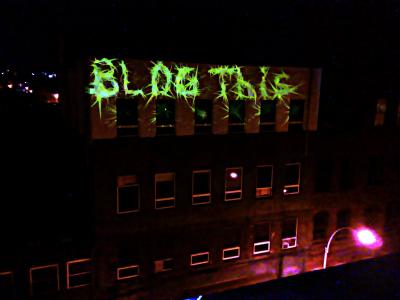
Blogging "Blog This"
On Saturday, Cameron Browning and I joined up with the boys from Mein Stiffi and had a projection party with Splnlss on his roof in Williamsburg, Brooklyn. We were testing out a project I've dubbed "Steadman," which is a crazy looking drawing tool we created on a slow day in the lab this past August. The results remind me a lot of Ralph Steadman's work.
We've been sort of picking at it now and then. It has tablet support, so you can take your handy Wacom and use the pressure of the pen to adjust the madness of the line you're drawing. Next up... maybe some way of animating the output when it's done. Suggestions are welcome.
- Mike's blog
- Comments
- Read more


- 4934 reads
The View from the Rooftop
- Comments


- 11959 reads
tags
Copyright Mike Edwards 2006-2009. All content available under the Creative Commons Attribution ShareAlike license, unless otherwise noted.


